Rescuing the affordability screen that lost 40% of loan applicants.
The cash-loan flow was haemorrhaging applicants at a single step — the Financial Background screen. I diagnosed why, formed a hypothesis, and designed two competing redesigns to reduce cognitive load, separate consent from input, and rebuild trust at the exact moment users were asked for sensitive data.
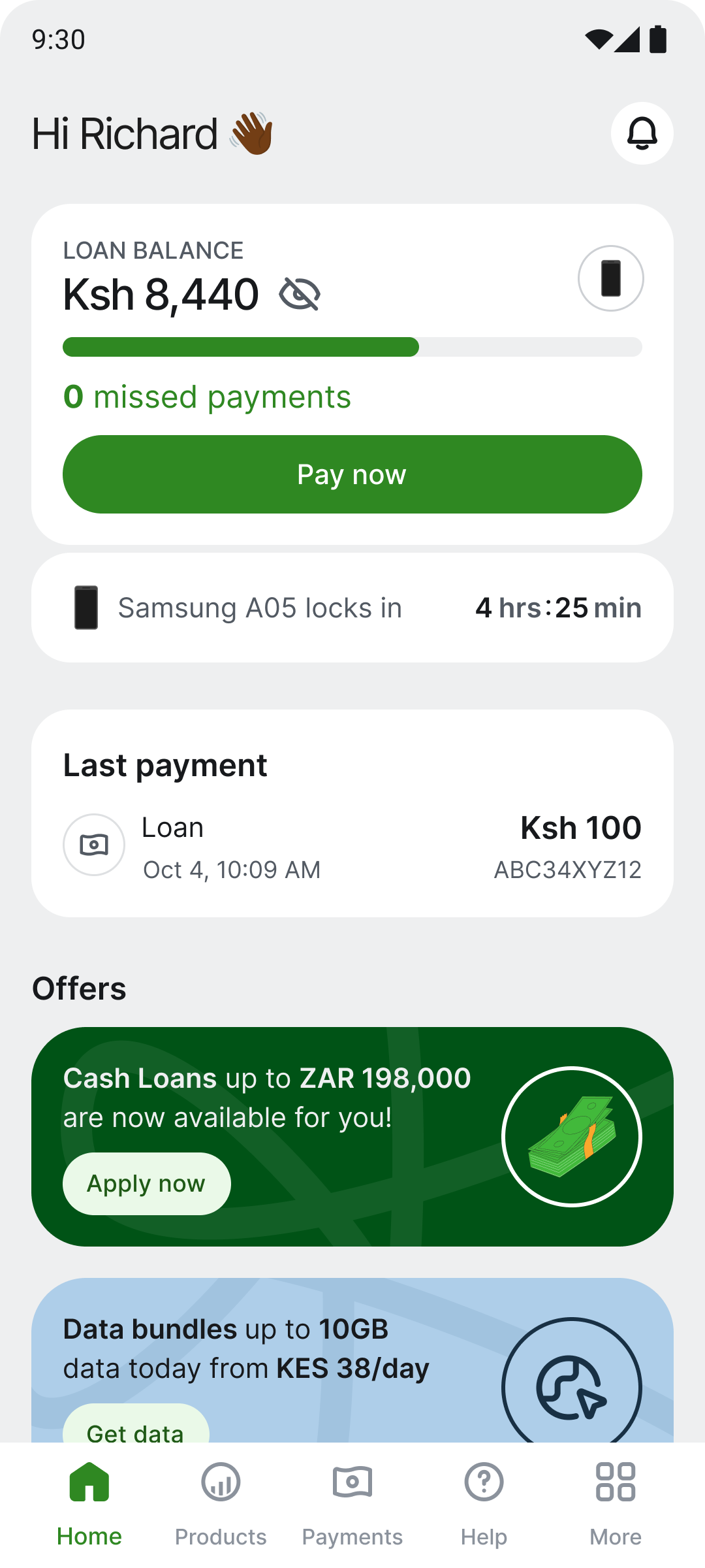
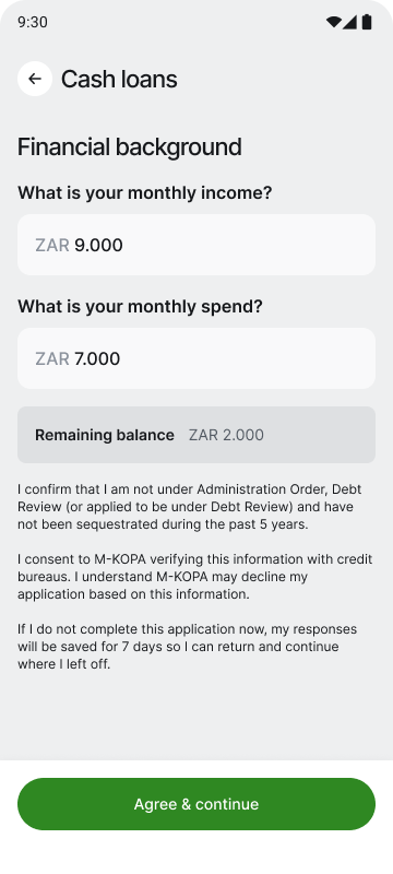
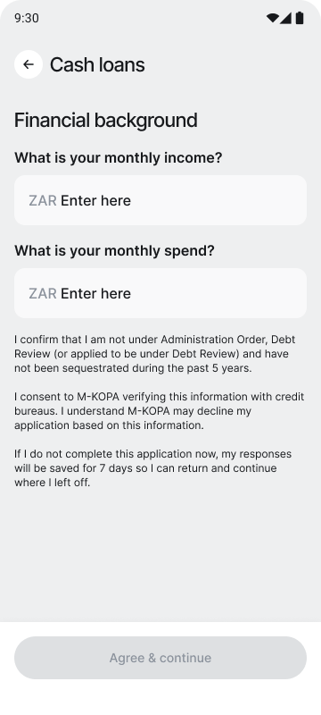
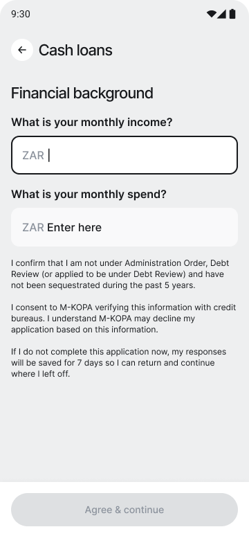
The cash-loan application had a drop-off rate over 40% on the Financial Background screen — where users enter monthly income and spend before seeing an offer. The original screen showed both fields at once, an auto-calculated "remaining balance", a dense consent paragraph, and a single "Agree & continue" button that fused legal agreement with navigation. No progress indicator, no explanation of why the data was needed.
From the home-screen offer banner ("Cash Loans up to ZAR 198,000"), applicants landed on the Financial Background screen. Over 40% dropped here — before ever seeing an offer.
If we reduce cognitive load at each step, separate consent from input, explain legal terms in plain language, and give a clear sense of progress and purpose — completion on the financial background screen should increase.
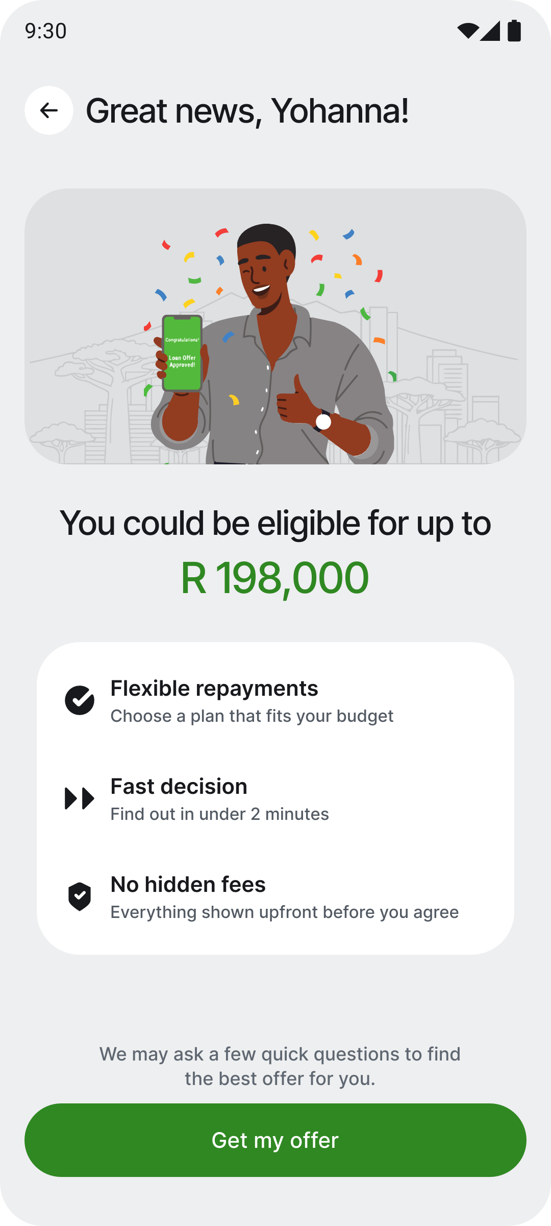
A warm welcome before a single question.
Before, tapping the offer banner dropped users straight into being asked for their income — no context, no reassurance, just a form. For a first-time, lower-literacy borrower, that cold open is exactly where hesitation starts.
So I introduced a pre-qualify welcome screen — an on-ramp, not a gate. It leads with the reward ("You could be eligible for up to R 198,000"), sets expectations with three quick benefit rows, and only then invites the user forward. It reframes the moment from "fill out a form" to "claim something that's already yours."
Progressive reveal — one question per screen
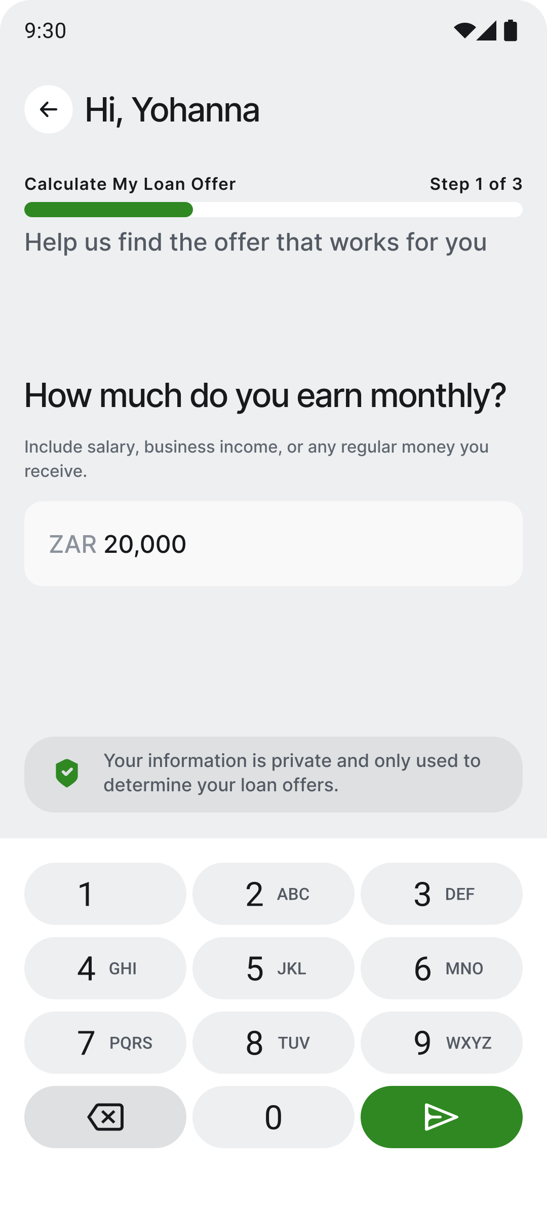
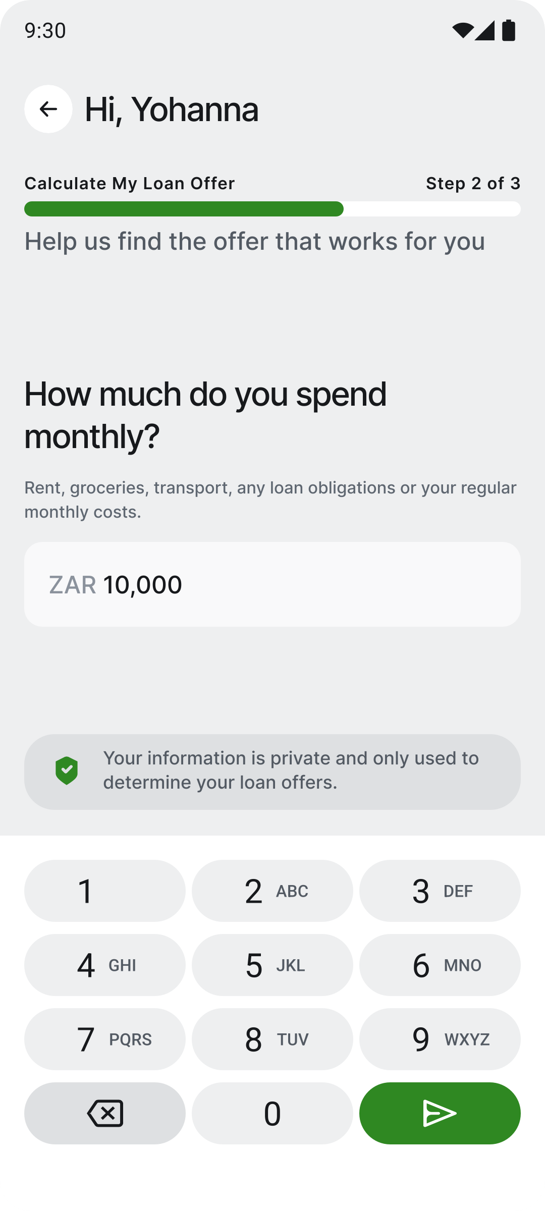
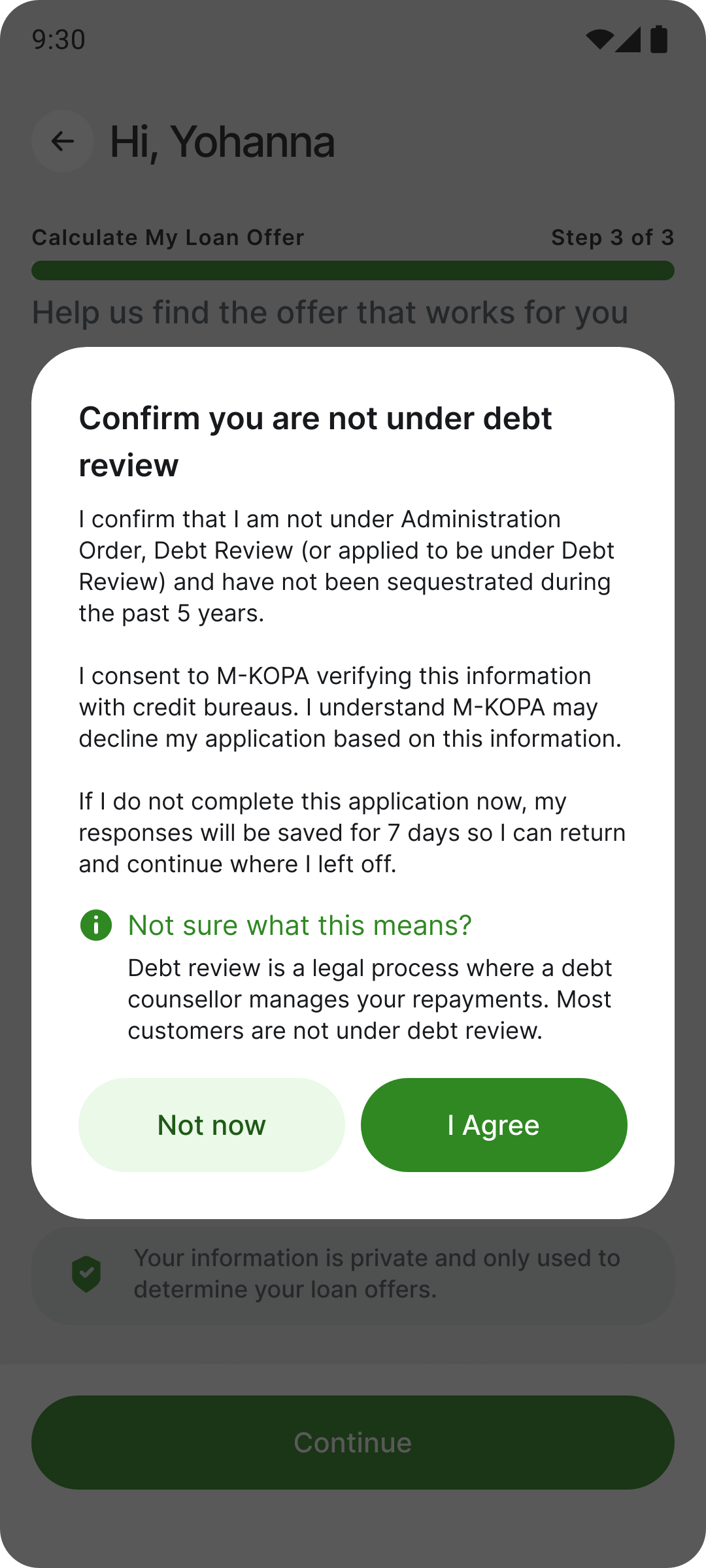
Split the step into two dedicated full screens — one for income, one for spend. Each shows a single large question, a helper line and a ZAR field, with the keyboard auto-focused on entry. A trust banner stays anchored above the keyboard, visible exactly when anxiety peaks. Consent then appears as its own focused modal before loading and offers. The bet: one question at a time keeps attention undivided — optimised for first-time, lower-literacy, anxious users.
Show the eligible amount (ZAR 198,000) with a count-up, the cash illustration, and three benefit rows before asking for effort. Showing the reward first is a proven conversion pattern.
Income and spend split into two full screens, each a single large question and input. One question at a time removes ambiguity and leaves no room for distraction.
Focus fires the system keyboard on screen entry — zero tap-to-focus friction. "ZAR Enter here" reads as guidance, not a pre-filled value. Send arrow stays disabled until a digit is entered.
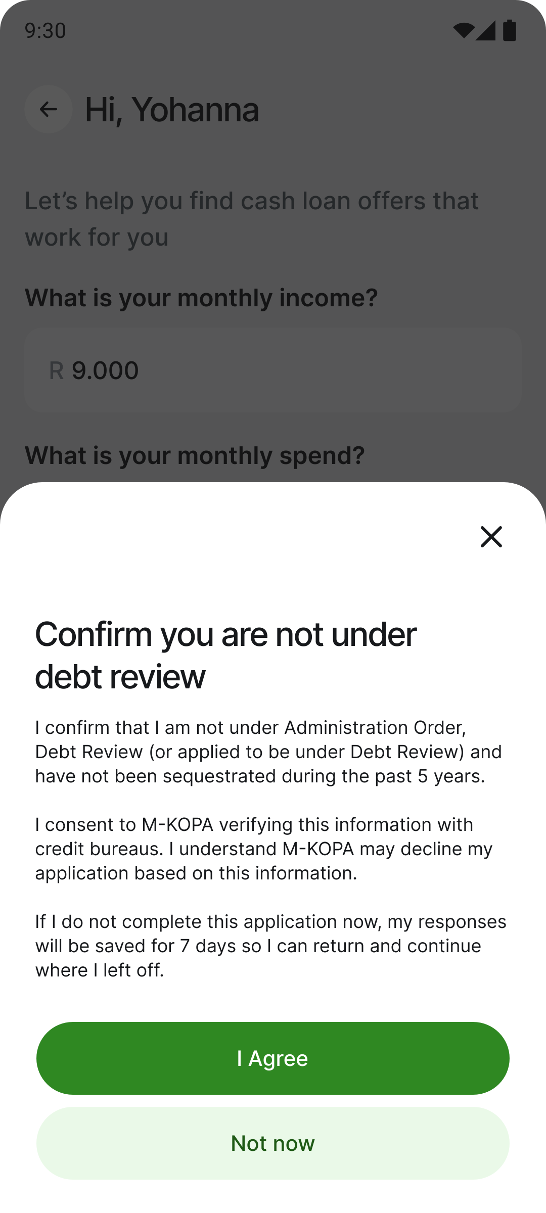
After both values are entered, a dialog presents the debt-review consent with a tappable "Not sure what this means?" explainer. Impossible to miss; shown once users are already committed.
"Calculate My Loan Offer — Step X of 3" gives the bar meaning beyond position. Users understand how far they've come and why they're doing it.
A shield + "Your information is private…" banner pinned to the top edge of the keyboard, guaranteed in eyeline while typing — anxiety peaks at the moment of entry, not before.
A heatmap of the income screen showed attention concentrated exactly where it should be — on the question and the input. The key fix: the "ZAR 0.00" placeholder read as a pre-filled value and caused hesitation, so it became directive "ZAR Enter here".
Single screen — both fields, inline
An alternative to the same problem: both income and spend on one screen with native inputs and a single "Continue" CTA. Example-based placeholders ("ZAR e.g. 20,000") show format and scale; one deliberate action confirms both values. The shared consent dialog is identical to Solution 1. Lower-friction for confident and returning users — the trade-off is more visual complexity upfront.
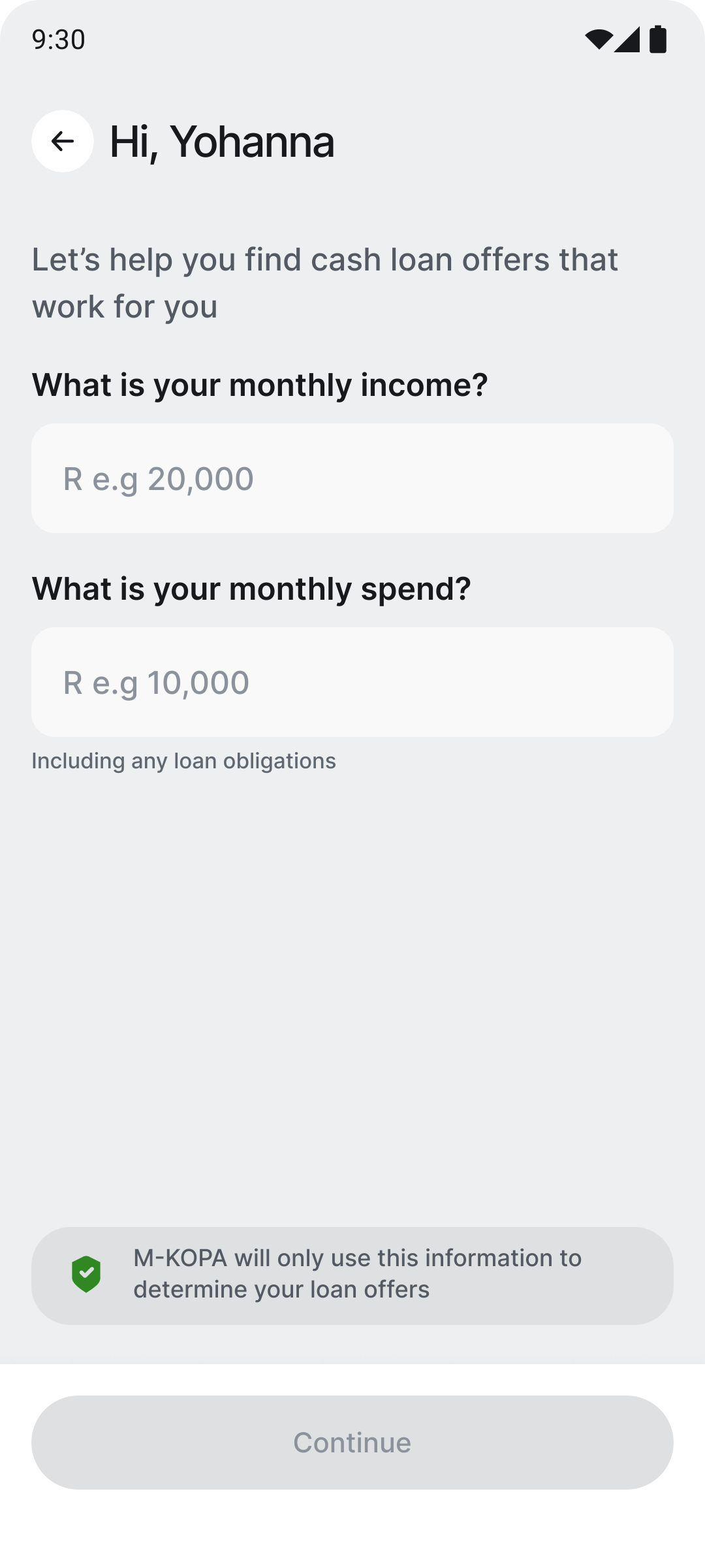
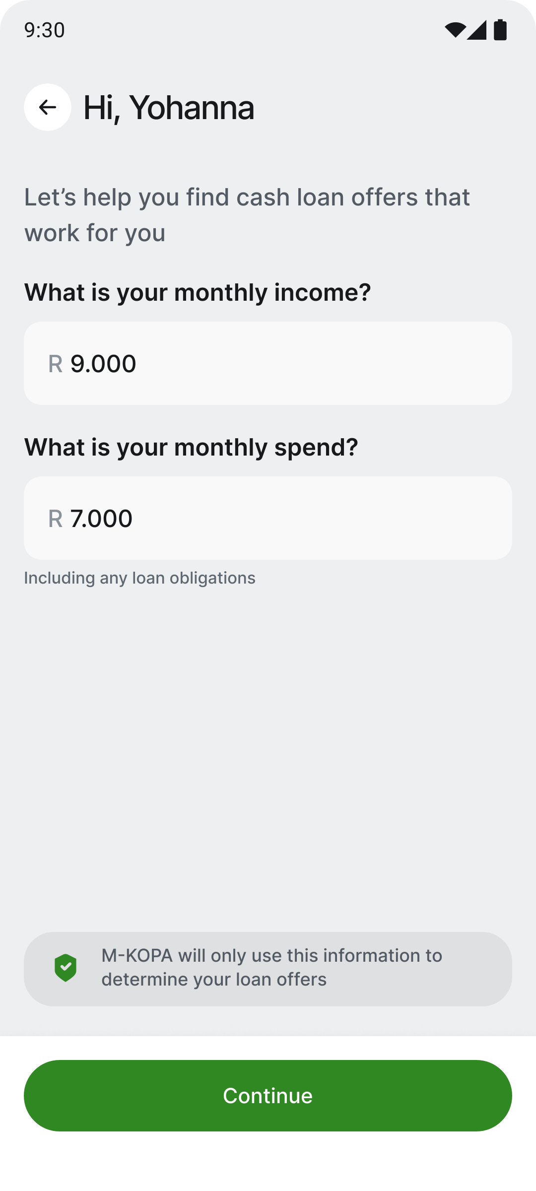
Income and spend sit together with a single "Continue" — fewer transitions for confident, returning users who already know both numbers.
"R e.g 20,000" shows both the currency format and a realistic scale, so users know exactly what — and how much — to type.
"Continue" stays disabled until both fields hold a value, so a single tap confirms the whole screen — no per-field submit ambiguity.
The debt-review dialog and "M-KOPA will only use this…" banner are shared with Solution 1 — so the A/B test isolates the layout, not the messaging.
Solution 2 is the faster path for confident users; Solution 1 is the safer path for anxious ones. The two were built to be tested against each other.
Both solutions are built and slated for an A/B test against the current production flow. This case study documents the diagnosis, hypothesis and design decisions — quantitative results will be added once the experiment reads out. Shared to show recent work and process.